Spec is an early-stage startup in need of an enterprise-level identity to grow to the next level. Spec is a customer journey security (no-code) platform that allows real-time honeypots to deter fraudsters, AI attacks, bots and other bad agents from affecting, exposing, or learning from, a client’s experience while keeping the customer’s journey completely frictionless.
I was hired to elevate the entire brand to prepare for the Q4 Series A premiere and keep growing the brand afterwards. The former logo had too many colors and gradients that made it hard to translate into printed materials and “swag”. The new brand needed to be more streamlined and ready to be aligned with other enterprise-ready companies.
When working with the executive team and learning the story of the company’s mission, I worked along several paths that the new brand and logo could take. The main idea is the thought of a streamlined ‘customer journey’ and having that visually reprsesented in the brand.
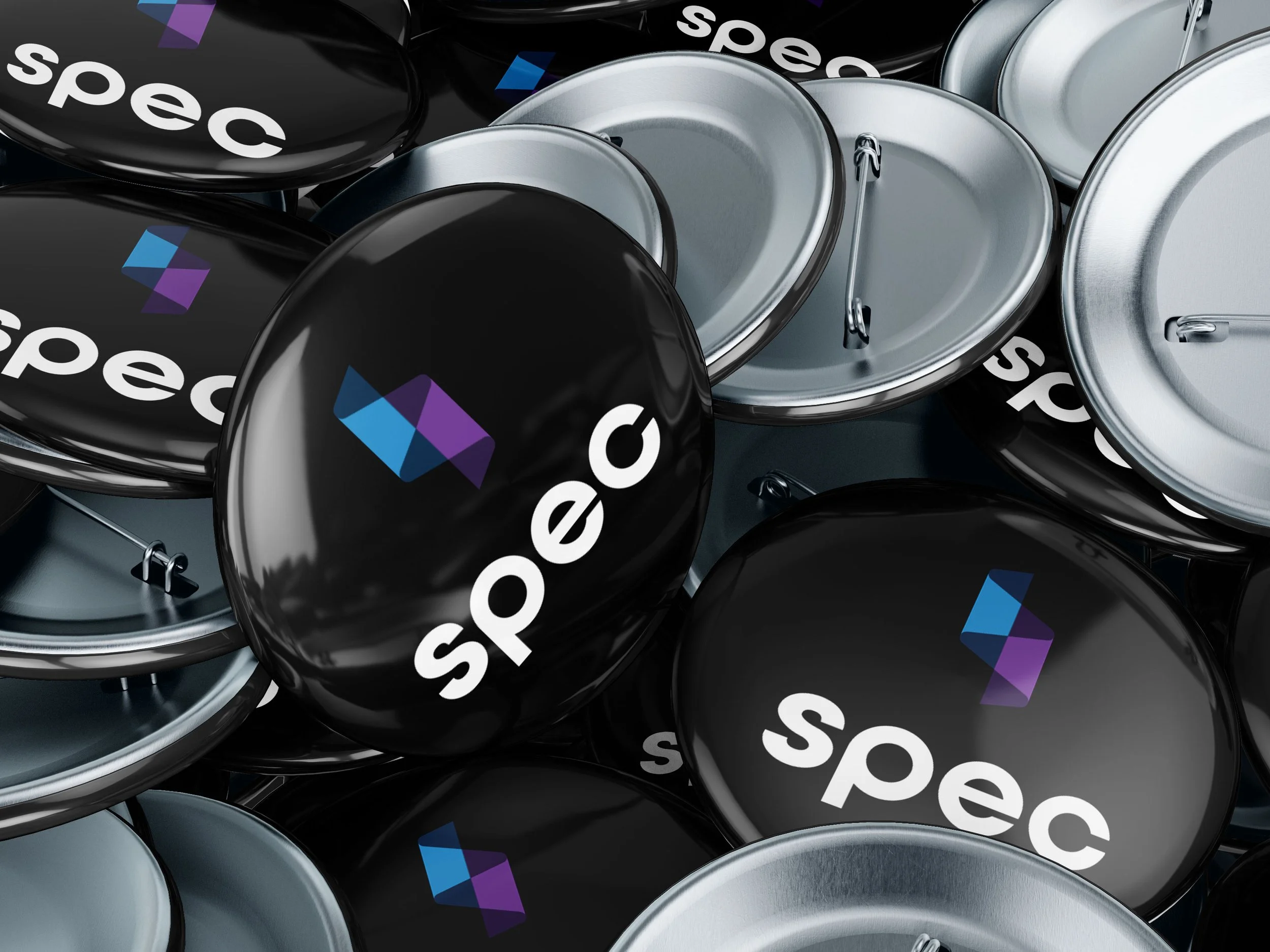
The logo is a seamless thread of the customer journey from one end of Spec to the other, while also being able to portray that journey in a 3-D way without using gradients (because as we all know, gradients are a pain in the booty when it comes to printing and one-color collateral) with a much more streamlined color palette. The result is a slick and enterprise-ready logo that has proven to be flexible enough to be applied wherever it is needed.
Launch: Q2 2023
Team: Spec
Roles: Creative Director, Solo


