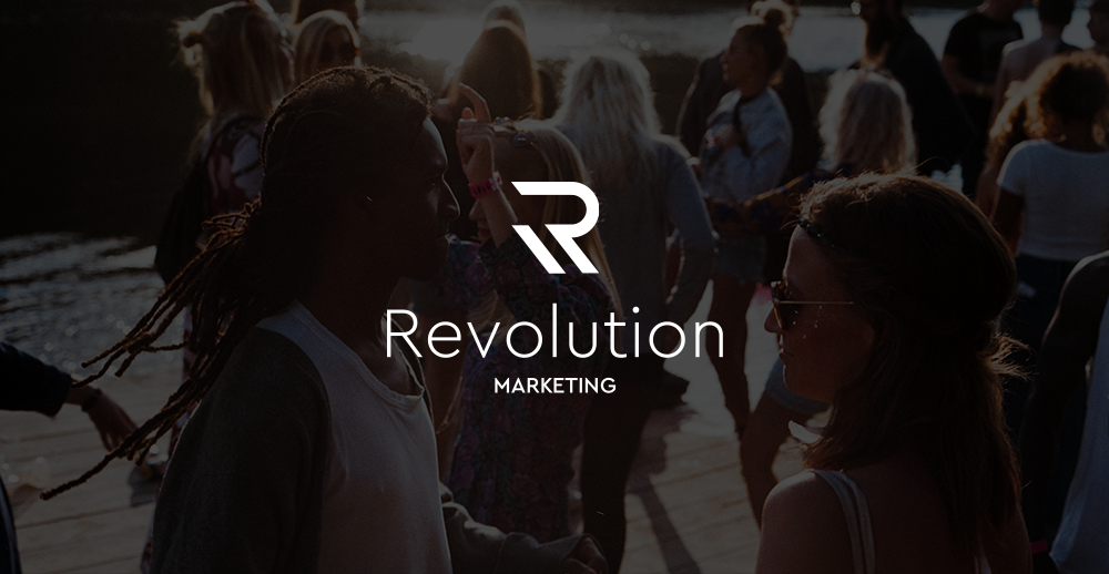
Revolution is an experiential agency that executes live activations and guerrilla marketing projects at major music festivals, tours, and public and private spaces. Their brand identity had not kept up with the kind of work they were capable of. The previous look was reminiscent of Web 1.0, and my task was to introduce a slick and powerful new visual direction that was true to a company creating immersive and groundbreaking experiences. After thorough competitor research and sketching out concepts, the logo concept I arrived at an abstraction of the letter R. The angles create visual movement, while the second slant creates a strong anchor and makes it feel balanced and sturdy. The typeface was chosen for its clean lines that mimic the slant and rounded curves of the mark. Their new website was a unique challenge because it has to be a single page. With some help from the developer on the project, we were able to figure out a solution on how to appropriately showcase case studies on a single landing page without using lightboxes for a mobile-friendly approach.
Launch: 2017
Team: Sanborn Agency
Roles: Design Lead, Logo Creation / Branding, UI/UX


Business cards and proposed t-shirt

Sketches

One-pager website